Enhancing Accessibility and Reducing Customer Support Calls
Ann Arbor residents experienced difficulty navigating the site and managing their water billing, leading to frequent calls for assistance.
The kickoff meeting revealed a need to cut down on unnecessary customer phone calls by improving information accessibility. Our research also uncovered significant gaps in essential accessibility features for various user categories
We streamlined the user navigation time by 90%
The department implemented our recommendations within six weeks, improving the experience for over 50,000 customers. Task completion times dropped from over three minutes to 30 seconds, reducing customer inquiries and enhancing satisfaction with water billing services.
UX Researcher
As part of the UX CUTGroup we applied usability testing methods to the Ann Arbor water billing website.
We utilized three methods:
01. Onboarding User Interviews:
Conducted usability testing and evaluation for the Dialysafe app
02. Usability Testing:
Worked with the project manager and softwere development team to implement improvements.
03. Card Sorting Activity:
I recommended design improvements to ensure a seamless interaction and flow between patients and mentors, enhancing overall usability and effectiveness.
Improving Website Content
We used card sorting to evaluate the organization of content on the website based on resident feedback. The goal was:
💡 Ranking the content headline of the website based on how likely they would use
💡 Identifying unclear wordings

Discover user's pain points and preferences through Usability Testing
During the user testing phase, we identified two primary goals: 💡 Examining how users approach and resolve encountered problems during the billing process.
💡 Understanding how users typically pay their water bills
Recruiting Challenges
With just 24 hours before our scheduled in-person interviews, 100% of our participants canceled.
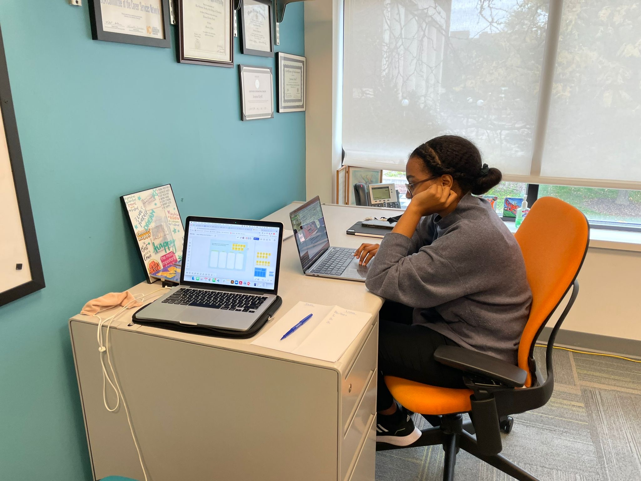
Despite this setback, we quickly and switched our in-person testing into virtual testing sessions, utilizing tools such as Zoom, Miro, and Google Drive. Through these efforts, we successfully recruited 9 participants and conducted internal team demos to ensure a seamless testing process.

Findings and solutions
01. Accessibility and Information Clarity
The website does not accommodate diverse user payment preferences
- Findings: The lack of visual hierarchy, poor color contrast, and vague hyperlinks led to cognitive overload, making it difficult for users to navigate and find information. Ambiguous headlines also confused users, increasing task completion time.
- Solution: Enhanced visual hierarchy by reorganizing payment options, improving color contrast, and enlarging text for better readability. Revised vague links like "click here" to be more descriptive, aiding screen reader users and those with visual impairments.

02. Streamlined Navigation for Task-Oriented Users
Customers are task oriented. However, they have to click through several links to complete their task.
- Findings: Users struggled with excessive clicks and irrelevant content (e.g., AquaHawk details), preferring to contact customer service rather than use the website.
- Solution: Simplified navigation by adding a "Quick Links" section, removing irrelevant content, and clarifying headings. This reduced user reliance on customer service by making commonly sought information easier to access.
.png)